
I recently implemented a new Azure Application Gateway and was interested to chart the connections through it per hour, grouped by HTTP Response Code. My initial attempt was this query:
AzureDiagnostics
| where OperationName == 'ApplicationGatewayAccess'
| summarize count() by bin(TimeGenerated,1h), httpStatus_d
| render columnchart
But this didn’t generate the chart I expected, instead creating one that looked this this (with two values, count_ and httpStatus_d):
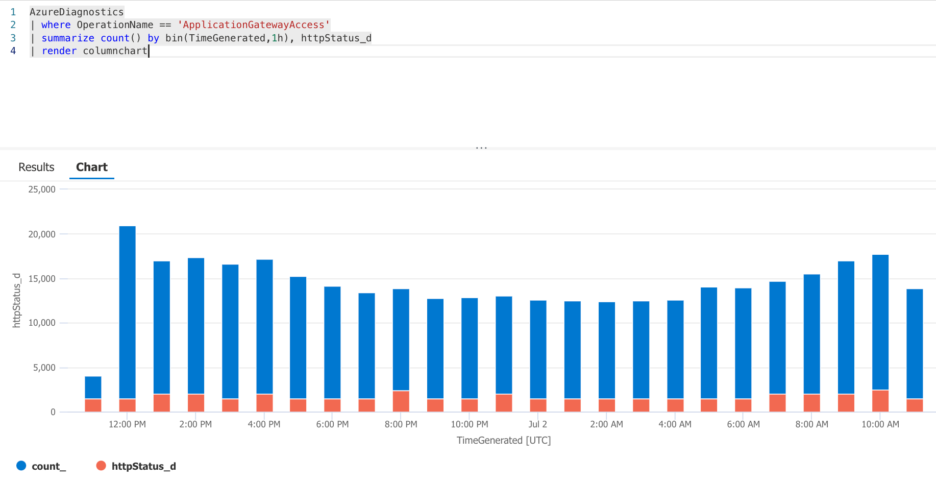
I eventually realised the issue was due to the httpStatus_d field being a numeric value, which seems to confuse the summarize operator. To work around this you need to use the tostring() function to convert it to a string:
AzureDiagnostics
| where OperationName == 'ApplicationGatewayAccess'
| summarize count() by bin(TimeGenerated,1h), tostring(httpStatus_d)
| render columnchart
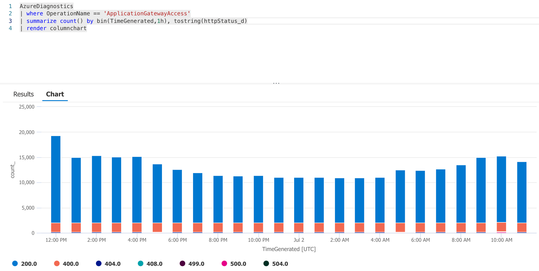
This generated the chart I wanted, but because httpstatus_d has a data type of real it treats it as a decimal value and the HTTP status codes (once converted to strings) subsequently have a .0 at the end.
If you want to get it to convert httpstatus_d as integers, you can use toint() on them first, as follows:
AzureDiagnostics
| where OperationName == 'ApplicationGatewayAccess'
| summarize count() by bin(TimeGenerated,1h), tostring(toint(httpStatus_d))
| render columnchart
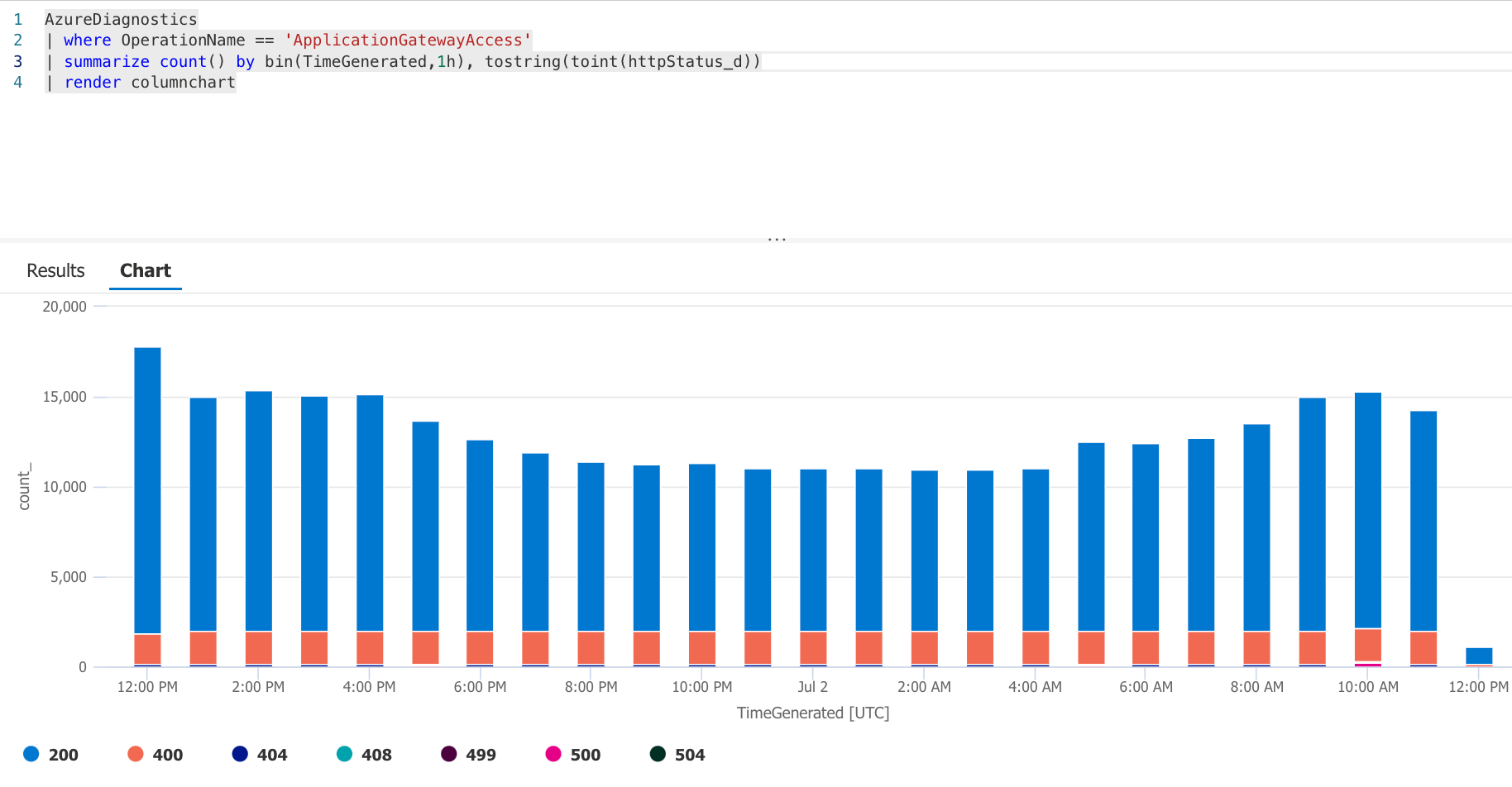
And voila, an Azure Application Gateway traffic graph displaying connections by status code, per hour.


Comments